Choosing the perfect AGA colour for your kitchen
"Which AGA colour goes best with my kitchen?" With so many colour options available, choosing the perfect AGA colour for your space can be a challenge! But there are a few things to consider that can help you narrow down your options and make the decision easier...
Choosing the perfect colour for your AGA is a big decision. After all, it's likely to be the first thing you see when you walk into the kitchen every morning for the next several decades. The colour should delight you. Not just the first few times you see it, but for years into the future.
With so many shades to choose from – and a bespoke service that can create any colour you desire – the question isn't whether you'll find something you love. It's having the courage to go for it. An interior designer once gave us a piece of advice we've been passing on to customers ever since: don't play it safe. Choose the colour that excites you most, the one you keep coming back to. Your AGA is built to last a lifetime, so it's the one thing in your kitchen you won't be changing… unless you choose to have it re-enamelled down the line.
We are one of AGA's original five distributors since 1932. Here's what decades of experience has taught us about choosing the right colour AGA for your kitchen.
Statement or harmony? A question of mood
When we talk to customers about AGA colour, the conversation usually comes down to a question of mood. Do you want drama, for your AGA to be the statement piece – a rich Aubergine glowing against pale oak for example, or a Raspberry that lifts the whole room? Or do you want something more enveloping, where the AGA and kitchen are within the same tonal range?
We love what happens when customers choose an AGA in a similar colour to their cabinetry – such as a black AGA in a dark kitchen, or an Olivine AGA in a sage-green scheme. The colour-drenching effect feels wonderfully luxurious. Everything just flows.
Both approaches work beautifully. But one thing we can tell you with certainty: whatever colour you choose, the AGA will always be the focal point. Even when you're deliberately choosing something harmonious with your kitchen, there's something about the solid presence of that cast iron that draws the eye. So if you're torn between the safe choice and the exciting one, our advice is to go for the exciting one. A strong colour will anchor your kitchen through every change you make around it – new worktops, different cabinets, a fresh coat of paint on the walls. The important thing is that it's a colour you love.
How vitreous enamel behaves in your kitchen
Every AGA is coated in vitreous enamel – a glass-like finish fired at extremely high temperatures, giving it that distinctive depth and lustre. Unlike paint, this enamel is highly reflective, which means paler colours will pick up and respond to the tones around them. A cream AGA opposite a dark blue island will pick up a subtle blue tone. A Linen AGA in a room with oak flooring will glow warmer than the same model on cool-toned stone flags. It's one of the loveliest things about living with an AGA – the colour becomes part of the room, shifting gently with the light and the seasons.
This is why we always recommend ordering enamel samples from us and spending time with them in your own kitchen. Stand them against your cabinetry, your worktops, your wall colour. Try them in morning light and again in the evening – you'll see how the colour comes alive differently throughout the day.
AGA colours by family
It's most useful to think about AGA colours in families, grouped by the kind of mood they create in a room.
Neutrals and classics – Cream, White, Linen, Dove, Black
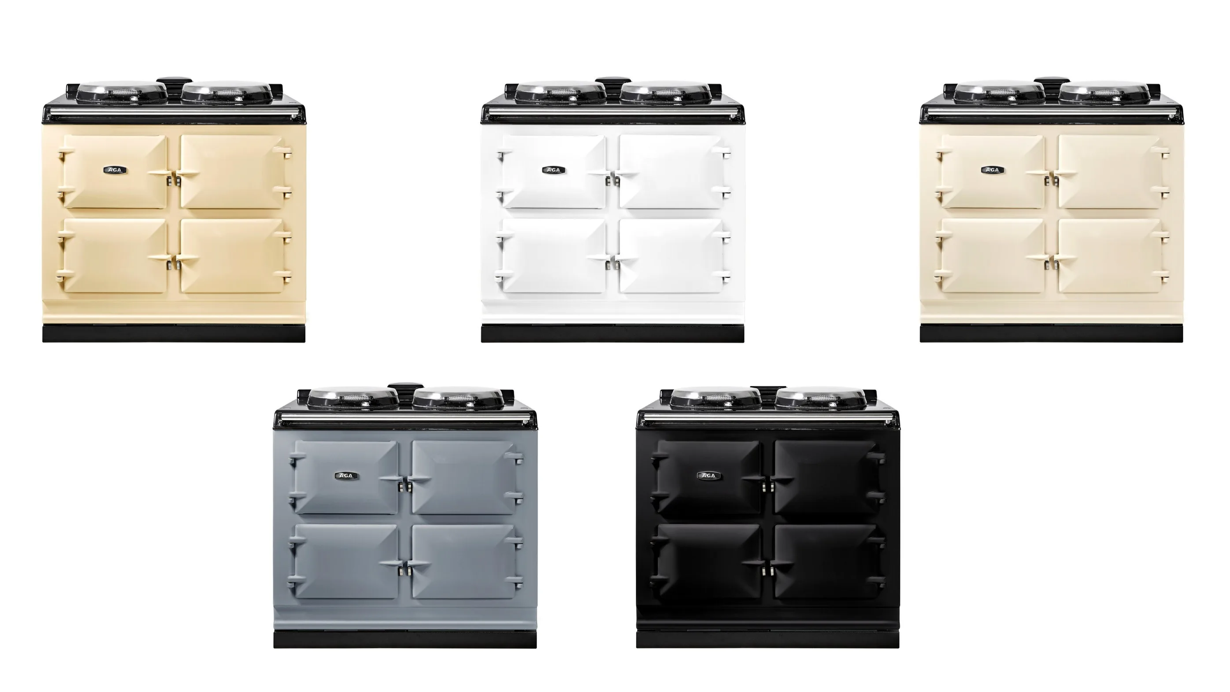
Black and Linen are consistently our most popular choices, and that’s been the case for years. Linen has gradually taken over from Cream – it's a softer, more contemporary neutral that feels a little less traditional without losing any of that warmth. White suits modern, pared-back kitchens with plenty of natural light. Dove is one we see less often, but love – a warm grey with a gentle pinkish undertone that works beautifully with blush tones and navy.
If you're drawn to this family of colours, try to resist the temptation to match your AGA exactly to your cabinetry. The enamel finish will always read differently from paint, and a near-miss looks more like an accident than a design choice. A deliberate tonal contrast or step in hue – Linen against warm grey cabinets, or White set into something cooler – is much more satisfying to the eye.
Blues – Dark Blue, Dartmouth Blue, Salcombe Blue, Duck Egg Blue
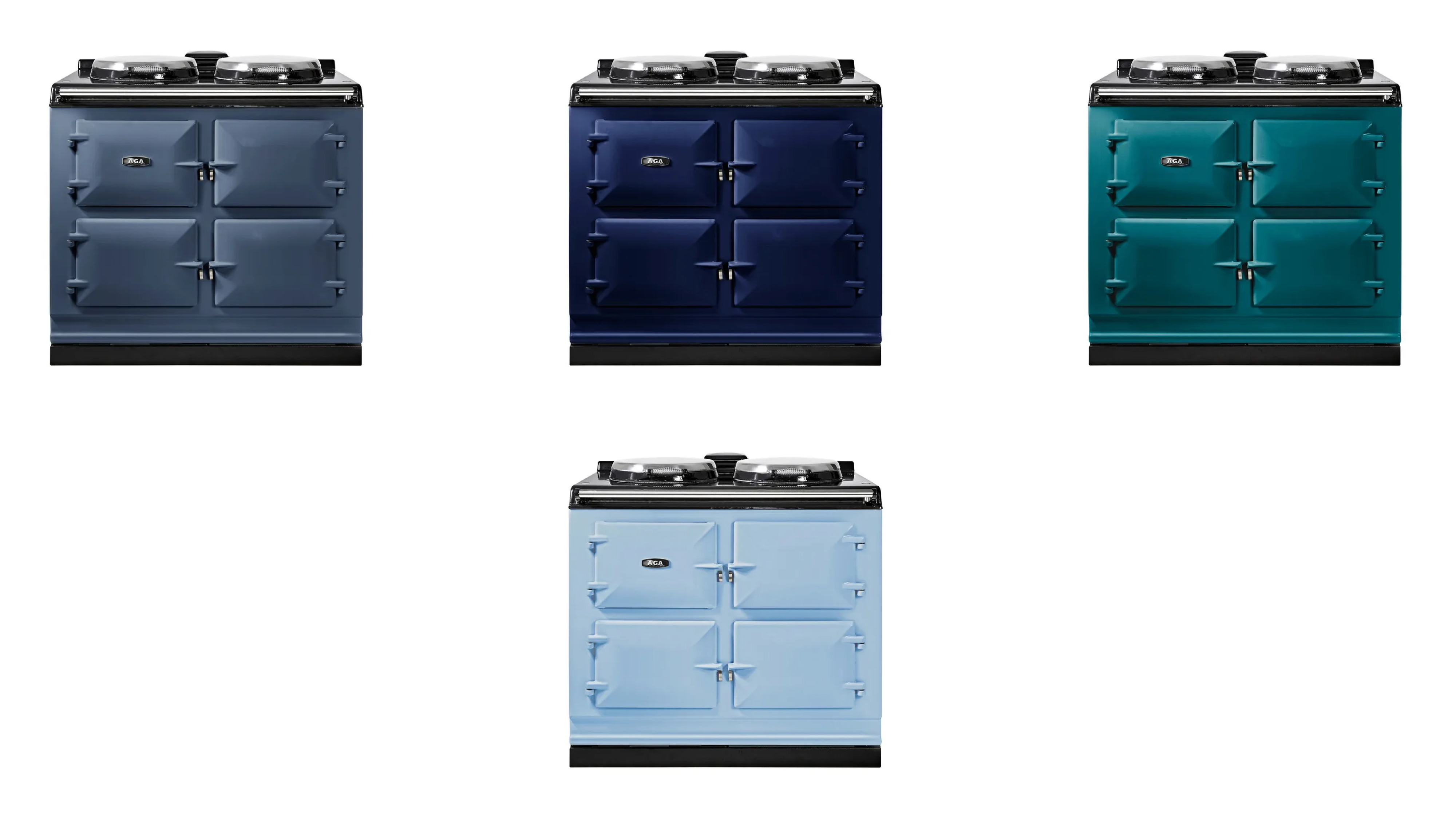
Blue is one of the most popular colour choices for an AGA, and it's easy to see why. Ed and I have Salcombe Blue in our own kitchen at home and love it – it's a versatile, characterful shade that changes mood depending on what surrounds it. Against pale stone cabinetry and earthy undertones, it feels coastal and relaxed. In a darker scheme it becomes something altogether more dramatic.
Dark Blue is the choice for people who want to create a sense of depth – it looks wonderful with mid-grey cabinets and brass hardware, in both traditional and contemporary kitchens. Dartmouth Blue is cooler and lighter, with a seaside quality. Duck Egg is the gentlest of the family – a classic country kitchen colour that feels particularly at home in older properties with lower ceilings and characterful proportions.
Greens – British Racing Green, Olivine
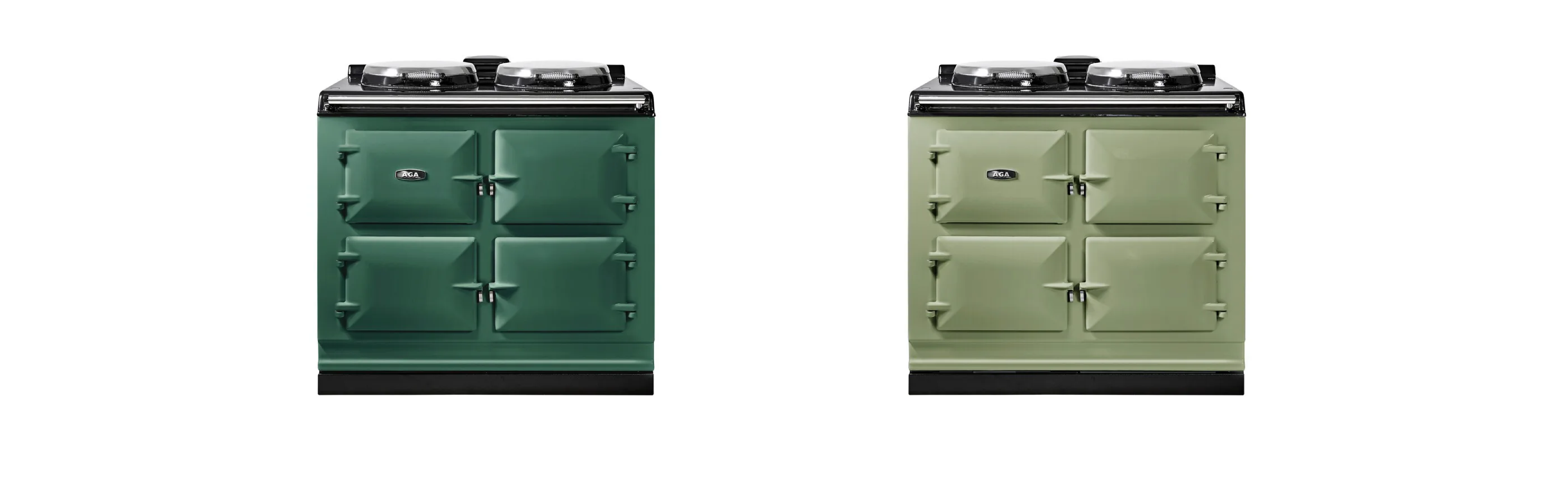
British Racing Green is a confident, handsome colour that looks superb with natural oak or walnut and brass fittings. It's a shade that suits kitchens with a sense of tradition – flagstone floors, a dresser in the corner, a table that's been in the family.
Olivine is quite different – a pale, Mediterranean olive that does unexpected things in a room. We have an Olivine AGA in a yellow kitchen at our Woodstock showroom, and the combination is just gorgeous. It's also beautiful in a sage coloured kitchen.
Greys – Pewter, Pearl Ashes, Slate
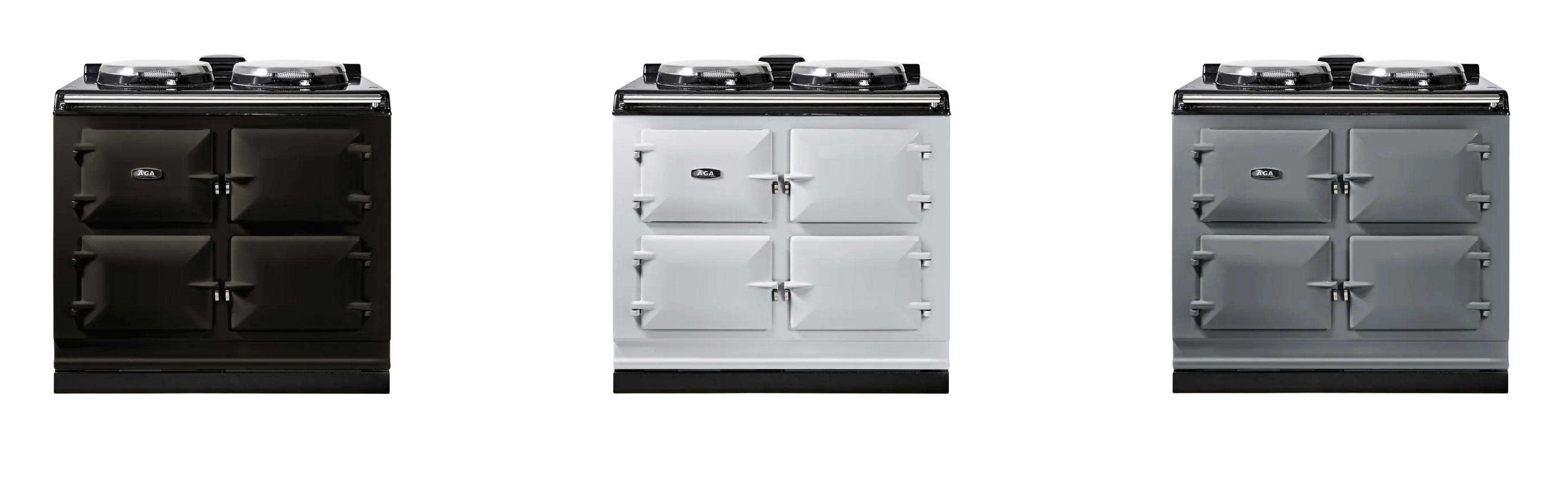
Greys are the most versatile colour family – they sit happily with almost anything. Warm creams, cool whites, timber, bold toned painted cabinets. Pewter is a deep and dramatic tone. Pearl Ashes is quieter and more understated, and Slate has a moody quality with blue-purple undertones that makes it a striking alternative to black. If you love dark kitchens but want something a touch softer, Slate is well worth considering.
Statement shades — Aubergine, Blush, Raspberry
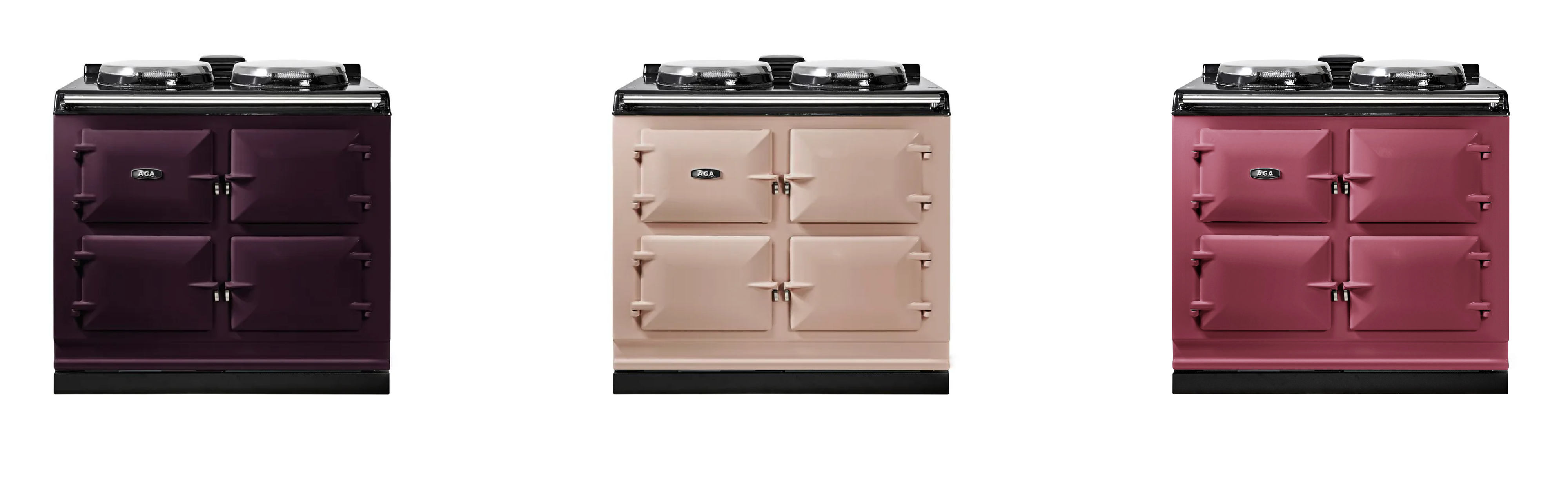
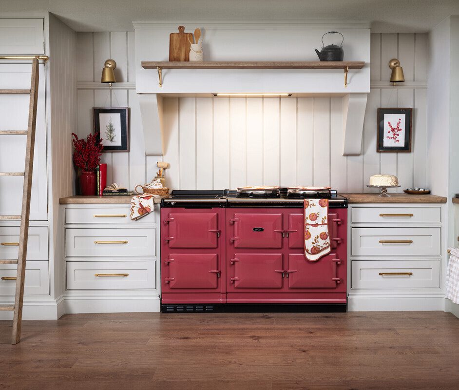
More and more of our customers are choosing bolder AGA colours, and the results are gorgeous. Raspberry, Aubergine and Blush are all beautiful statement colours, and the vitreous enamel gives these shades an extraordinary richness and depth. They really glow.
If we were choosing a new AGA tomorrow, we'd go for Blush or Raspberry. We'd pair the Blush with a black kitchen, and the Raspberry with lighter, linen-coloured cabinetry. These are the kinds of combinations that just sing when you see them in person.
The space around your AGA
Your splashback and cooker surround are a wonderful opportunity to frame your AGA and make the most of its colour. The right backdrop can turn that part of the kitchen into something really special.
Handmade tiles work particularly well – zellige tiles with their slightly irregular, reflective surface pick up the lustre of the enamel beautifully. Hand-painted or Delft-style tiles bring a heritage quality that suits the AGA's character. Tongue-and-groove panelling in a complementary shade is another lovely option – warm, textural, and very much at home in a country kitchen. And an over-mantel shelf is a beautiful finishing touch – somewhere for a favourite pot, a candle, a sprig of something seasonal.
Giving your AGA the space it deserves
There's something about an AGA placed centrally in a kitchen – with a generous worktop on either side and a beautiful splashback behind – that gives the whole room a sense of gravitas. If your layout allows it, this is always the approach we'd recommend.
AGA cookers are deeper than standard cookers (typically around 67cm), so cabinetry may need adjusting to sit flush. This is something we take care of as part of every installation. And if you have another large appliance – an American-style fridge-freezer, for instance – try to give each its own wall or sightline. The AGA deserves to be the thing you see when you walk into the room.
Finishing touches
Once the colour is decided, the details around the AGA bring everything together. AGA Cookshop offers coordinating textiles – hob covers and oven gloves designed to sit well with each shade. A stovetop kettle on the simmering plate is one of those things that's both practical and pleasing to the eye. Cast iron pans, a good set of AGA bakeware, a wooden board or two – these are the pieces you'll reach for every day, so they're worth choosing with care.
The bespoke colour service
f you have a shade in mind – a particular paint colour, a fabric you love, something you've seen and can't forget, that isn't available in the standard range of colours, get in touch and we can guide you through the process of bespoke colour matching. AGA will create your colour in vitreous enamel, and you'll receive an enamelled test piece to check in your own kitchen before production begins. Every AGA is made in the UK, and the enamel is what gives it that distinctive depth – these cookers are never spray-painted.
Most customers find their colour within the standard range, but we've worked on some lovely bespoke projects. Most recently, we helped a customer commission an AGA in Studio Green by Farrow & Ball, and worked with Yardley Bespoke to have the chrome hardware – lid handles and towel rail – changed to brass. The result is stunning and completely unique.
Frequently asked questions
How many colours does AGA offer? Around twenty standard colours, from classic neutrals to bold statement shades. We keep enamel samples in our showrooms for you to see in person.
Can I get a custom AGA colour? Yes – AGA's bespoke colour service can match virtually any shade. Get in touch and we'll talk you through the process.
How do I order AGA colour samples? Get in touch, or visit one of our showrooms. We always recommend seeing samples in your own kitchen – the reflective enamel is strongly influenced by surrounding surfaces and lighting.
Should I match my AGA to my kitchen cabinets? Not necessarily. Vitreous enamel reads differently from painted surfaces, and a near-match tends to look like a mistake. A deliberate contrast or tonal harmony often looks more striking.
What is the most popular AGA colour? Black and Linen are consistently our best sellers, while bolder shades like Raspberry, Aubergine and Salcombe Blue are also stunning and increasingly popular.
Ready to take the next step?
We can take you through through the options, and help you find the right colour for your kitchen.
If you're just in the early stages of decision making, we've created a guide to AGA pricing, models and what's included, which walks you through the options and what to expect. And if you already have an AGA and you're curious about how a modern electric model fits into family life through the seasons, you can learn about our family's own experience here.
If you've been thinking about a new AGA – whether you're replacing an old one or considering your first – we invite you to visit our showrooms in Reading or Woodstock. Give us a ring, drop us an email, or book an appointment at one of our showrooms, where Caroline or Ed will walk you through the options over a cup of tea.


