Choosing the perfect Rayburn colour for your kitchen
A Rayburn will be the warm centrepiece of your kitchen for decades. Which makes the question of which colour to choose one of the most exciting design decisions in any kitchen project. Our complete guide to all sixteen shades in the Rayburn palette – and how to find the one that's right for your home.
Of all the items you might choose for your kitchen, we're willing to bet that the Rayburn will be one of the most enduring. As the years pass, cabinets will be replaced, walls repainted and worktops refitted, but your Rayburn will be around for decades.
For this reason, the question of which Rayburn colour to choose deserves real thought. We at Edwards & Godding have been working with these extraordinary appliances for three generations, and during that time we've helped countless families make the decision. Here's what we've learnt, and our best advice to help you choose.
A design classic deserves a colour you love
The Rayburn is a true design classic. With that cast iron silhouette, those generous proportions, the depth and lustre of the enamel finish, it has real visual gravity. Whichever colour you choose, your Rayburn will be the centrepiece of your kitchen.
An interior designer once gave us a piece of advice we've been passing on to customers ever since: don't play it safe. Choose the colour that excites you most, the one you keep coming back to, the one you'll be glad to see every morning. Rest assured, whichever colour you choose, you'll have plenty of flexibility in how the kitchen evolves around it as the years pass and trends change. Even the boldest shades can be styled in completely different directions – a British Racing Green or Aubergine is just as at home alongside gentle neutral tones as it is in a dark, dramatic scheme, or layered with similar tones in a colour-drenched space.
Drama or harmony?
Let's begin with the question of mood. Do you want to create a dramatic statement, or would you prefer something softer, where the cooker sits within the same tonal range as the cabinetry?
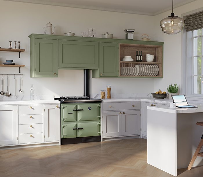
Both approaches work beautifully. Tonal harmony – a Linen Rayburn in a kitchen of warm neutrals, say, or an Olivine cooker against sage cabinetry – has a wonderful sense of calm and cohesion. On the other hand, you might prefer a dramatic palette, rich with contrast. An Aubergine Rayburn paired with a mix of dark blue cabinets and natural oak is a combination we particularly love. The tones just sing. Considered, characterful, not remotely safe.. and yet right at home.
A small word of caution if you choose the harmonious approach: resist the temptation to match your Rayburn exactly to your cabinetry. Vitreous enamel and painted wood are different surfaces, and a near-match tends to read as an accident rather than a decision. A deliberate tonal step is much more visually satisfying.
The Rayburn colour palette
Rayburns are available in sixteen colours, a palette that runs from traditional neutrals – Cream, White, Linen, Black – through a thoughtful range of blues, greens and greys, and into warmer shades like Aubergine and Blush. The colours fall into five natural families.
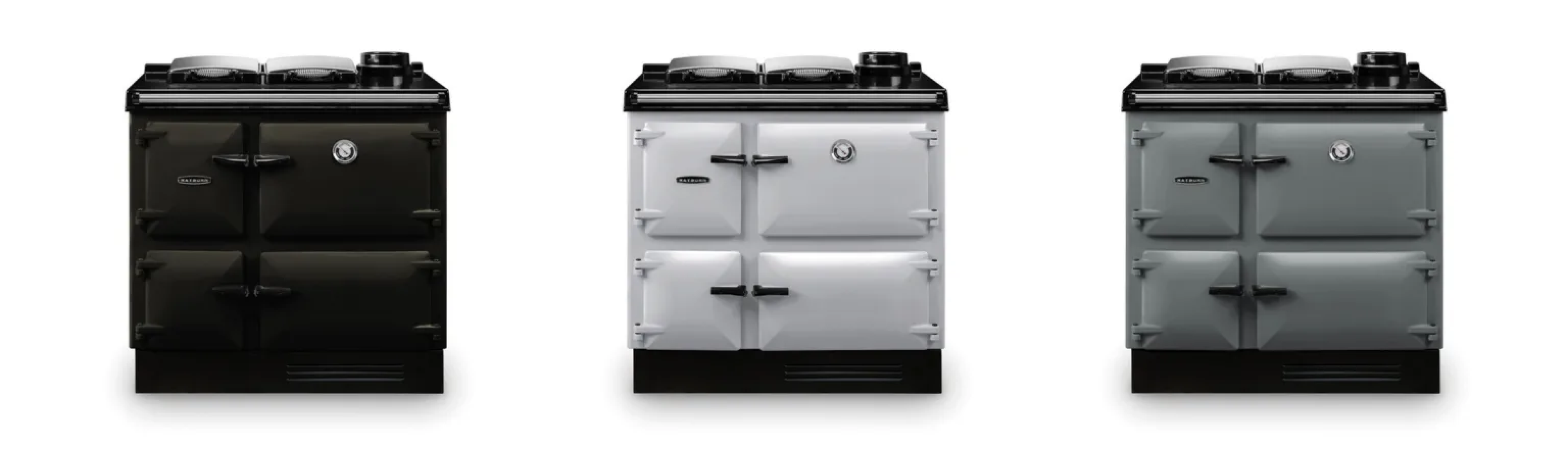
Neutrals and classics: Cream, White, Linen, Dove, Black
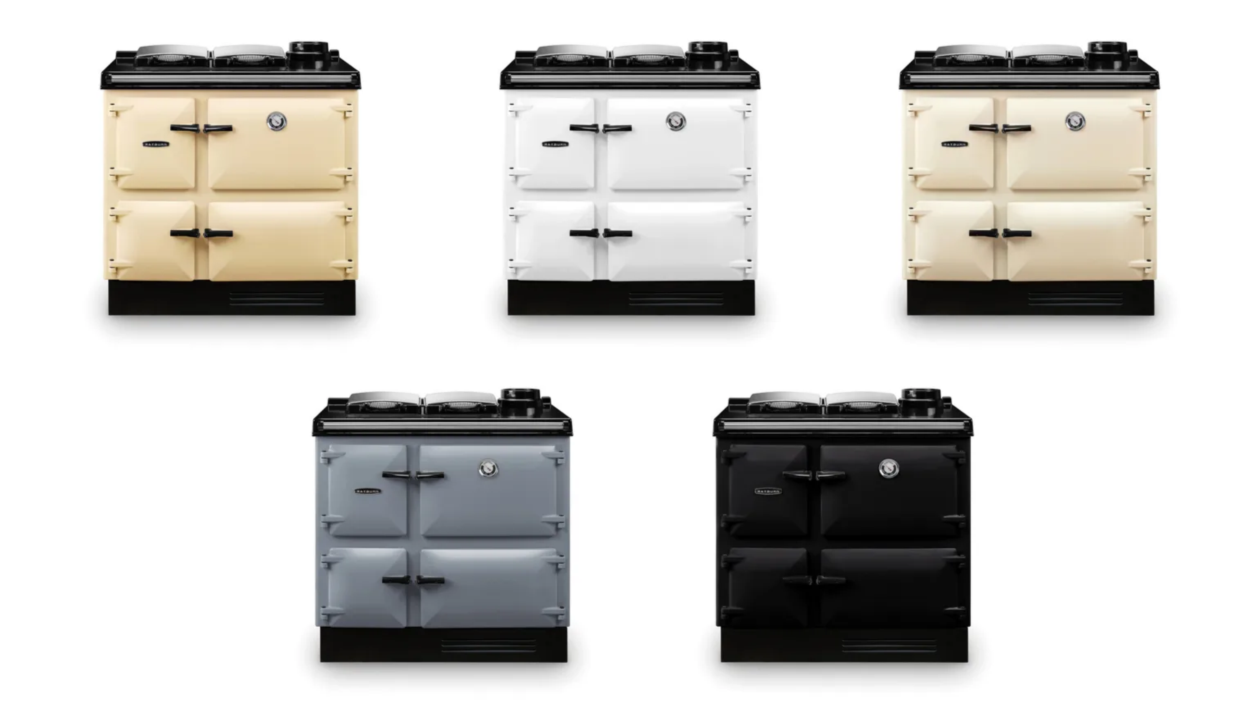
Cream and Linen are far and away our most popular Rayburn colours. Cream is the classic, traditional neutral – the colour many of us grew up with, the one most people instinctively picture when they think 'Rayburn'. Linen is a more contemporary option, softer and more relaxed. White suits pared-back schemes with plenty of natural light. Dove is one we see less often but love – a warm grey with a gentle pinkish undertone that pairs wonderfully with navy and blush tones. Black is timeless and dramatic, particularly effective against pale stone or oak.
Blues: Dark Blue, Dartmouth Blue, Salcombe Blue, Duck Egg Blue
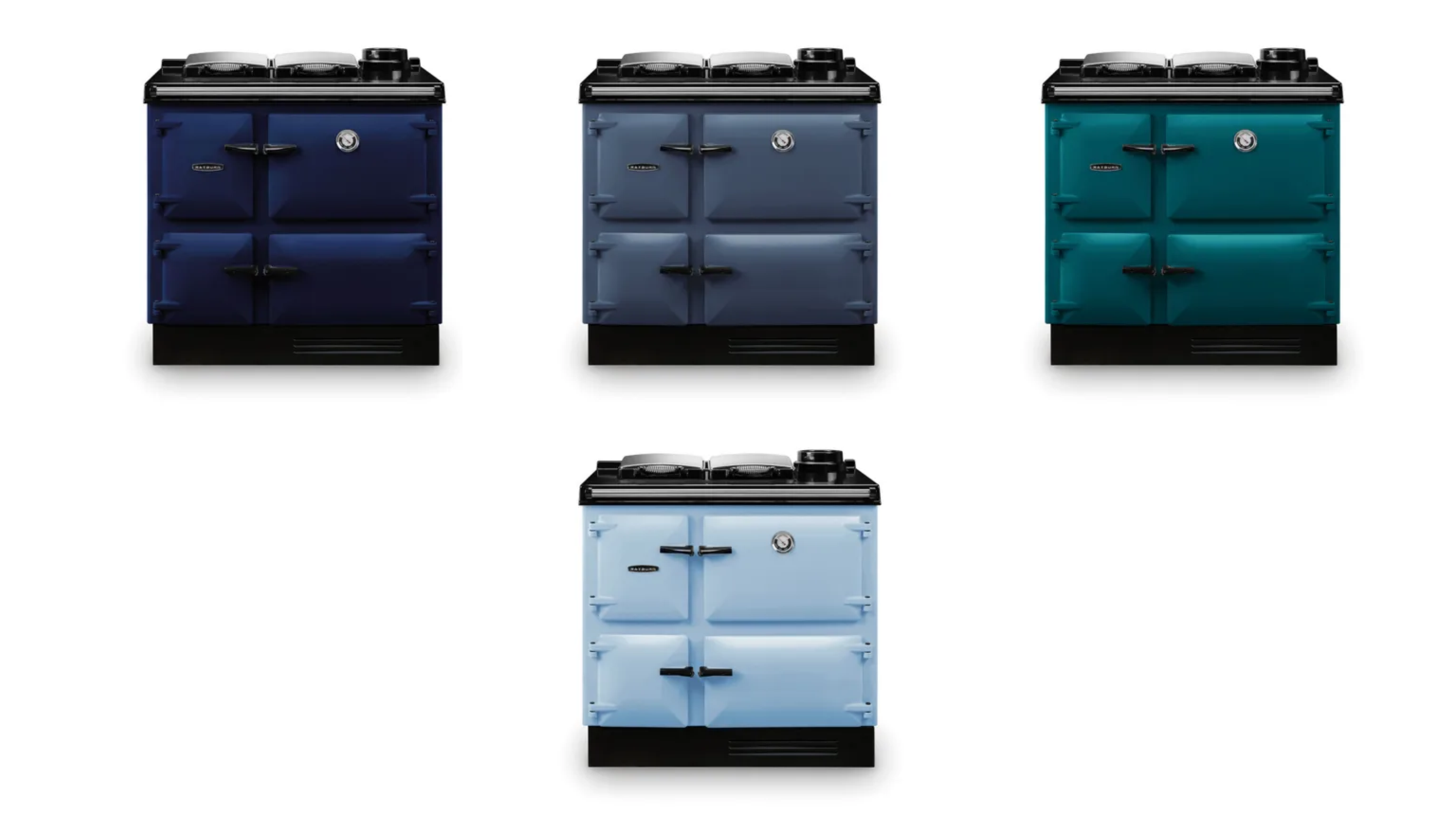
There's real variety within the blue family. Dark Blue is a classic choice – confident, grounded, beautiful with mid-grey cabinets and brass hardware. Dartmouth Blue is a blue-grey, with a coastal quality. Salcombe Blue is an intense green-blue – relaxed against pale stone, dramatic against dark cabinetry. Duck Egg Blue is a cheering tone, particularly at home in older properties.
Greens: British Racing Green and Olivine
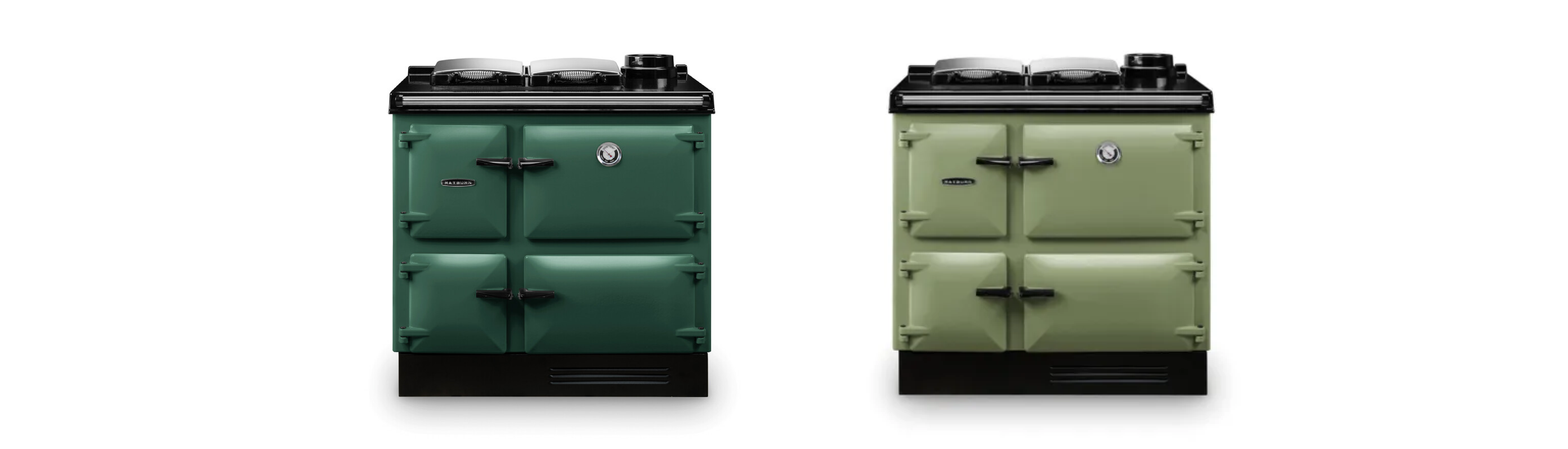
British Racing Green is always a handsome choice for a Rayburn, especially in kitchens with a traditional feel – flagstone floors, oak dressers. It looks superb against natural timber, and brass fittings sing against it.
Olivine is a muted green with real sophistication – it looks beautiful in colour-drenched schemes, or paired with warm yellow tones and natural wood.
Greys: Pewter, Pearl Ashes, Slate
The grey tones are wonderfully versatile – they sit happily in most schemes, from warm creams to cool whites to bold painted cabinetry. Pewter is the deepest and most dramatic, with a slightly earthy quality. Pearl Ashes is an understated and elegant tone with a softer washed feel. Slate is a considered alternative for anyone drawn to dark kitchens but seeking something subtle.
Aubergine and Blush

These two really glow – the vitreous enamel gives both of them an extraordinary depth. Aubergine is bold and unexpected, looking remarkable in a kitchen with strong contrasting tones (and beautiful, as we mentioned earlier, against dark blue and oak). Blush is a softer and more gentle option, with a slightly nostalgic feel that works beautifully in lighter, contemporary schemes.
How vitreous enamel behaves in your kitchen
It's worth understanding how vitreous enamel reads in a room before you make your decision. The finish is glass-like, fired at very high temperatures, resulting in an extraordinary depth of colour and a reflective quality that means lighter shades in particular will pick up and respond to the tones around them.
This has practical implications. A Cream Rayburn opposite a dark wood island will pick up those warm undertones; while the same Cream on a pale stone floor will feel noticeably cooler in colour. A Slate or Pewter Rayburn will look quite different in morning than in evening light. The colour shifts to reflect its surroundings.
For this reason, we recommend getting in touch with us to order a few colour samples. The swatch on your screen, or even in a printed brochure, won't show you how the enamel will behave once it's in your kitchen, picking up the tones of your cabinets, your walls, the changing light throughout the day. Once your samples arrive, set them up in your kitchen and look at them at different times of day. Check how the colour responds to your cabinets and countertop, to your floor. The right shade will become clear after a day or two.
The space around your Rayburn
Once you've chosen a colour, the materials around the Rayburn become the next consideration. A well-chosen splashback or cooker surround can frame the cooker beautifully. Handmade tiles work particularly well – zellige tiles with their irregular, reflective surfaces pick up the lustre of the enamel; Delft-style and hand-painted tiles bring a heritage quality that suits the Rayburn's character. Tongue-and-groove panelling in a complementary shade is another lovely option for more traditional kitchens. And an over-mantel shelf above the cooker – somewhere for a candle, a favourite pot, or a sprig of something seasonal – is a finishing touch that really does make a difference.
From sample to installation
Of course, the colour decision is one piece of a bigger conversation. Most Rayburns are doing significant technical work – central heating and hot water as well as cooking. If you'd like to read more about how a Rayburn works and which model might suit your home, our complete guide to Rayburn cookers is a good place to start.
Whichever model you choose – whether it's the Rayburn Heatranger with its full central heating capability or the more compact Rayburn 300 Series – Stuart, our specialist Rayburn engineer, will carry out your site survey, assess your existing system, the flue, and the heat output your home needs. From there, he and the team handles delivery, flue work, heating connections, the plinth, the final adjustments. We’ll even remind you when your annual service is due.
Ready to take the next step?
Want to see these colours in person? If you're thinking about a new Rayburn – whether you're replacing an old one or considering your first – we'd love to help. Give us a ring, drop us an email, or book an appointment at our Reading or Woodstock showroom. We look forward to hearing from you.


